
Finalists of the Young Designers Corner Award 2026
September 30, 2026
The time has come—the finalists for the 2026 “Young Designers Corner Award” jewelry competition have been selected! From among numerous submissions, the jury has chosen up-and-coming young designers who will have the opportunity to present their work at Gemworld Munich from October 22 to 25.
In addition to the prizes awarded by the jury, a public vote will also take place on the Munich Show’s Instagram account starting October 2.
Award ceremony for the 2026 “Young Designers Corner Award”:
Thursday, October 22, 2025 | 4:00 p.m. | Forum in Hall A2
The jewelry designs of this year's finalists for the Young Designers Corner Award
Florian Anderer (Germany)
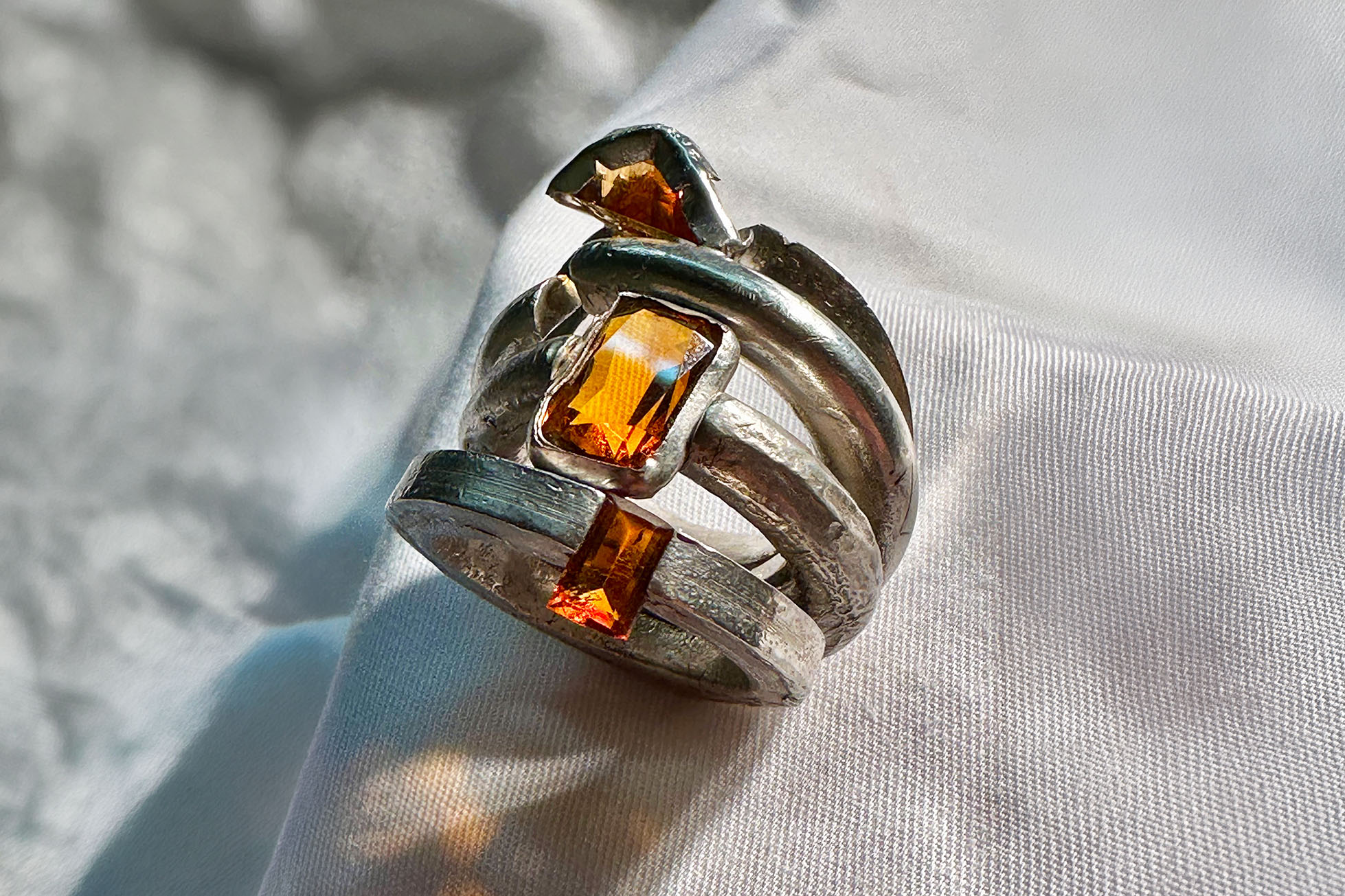
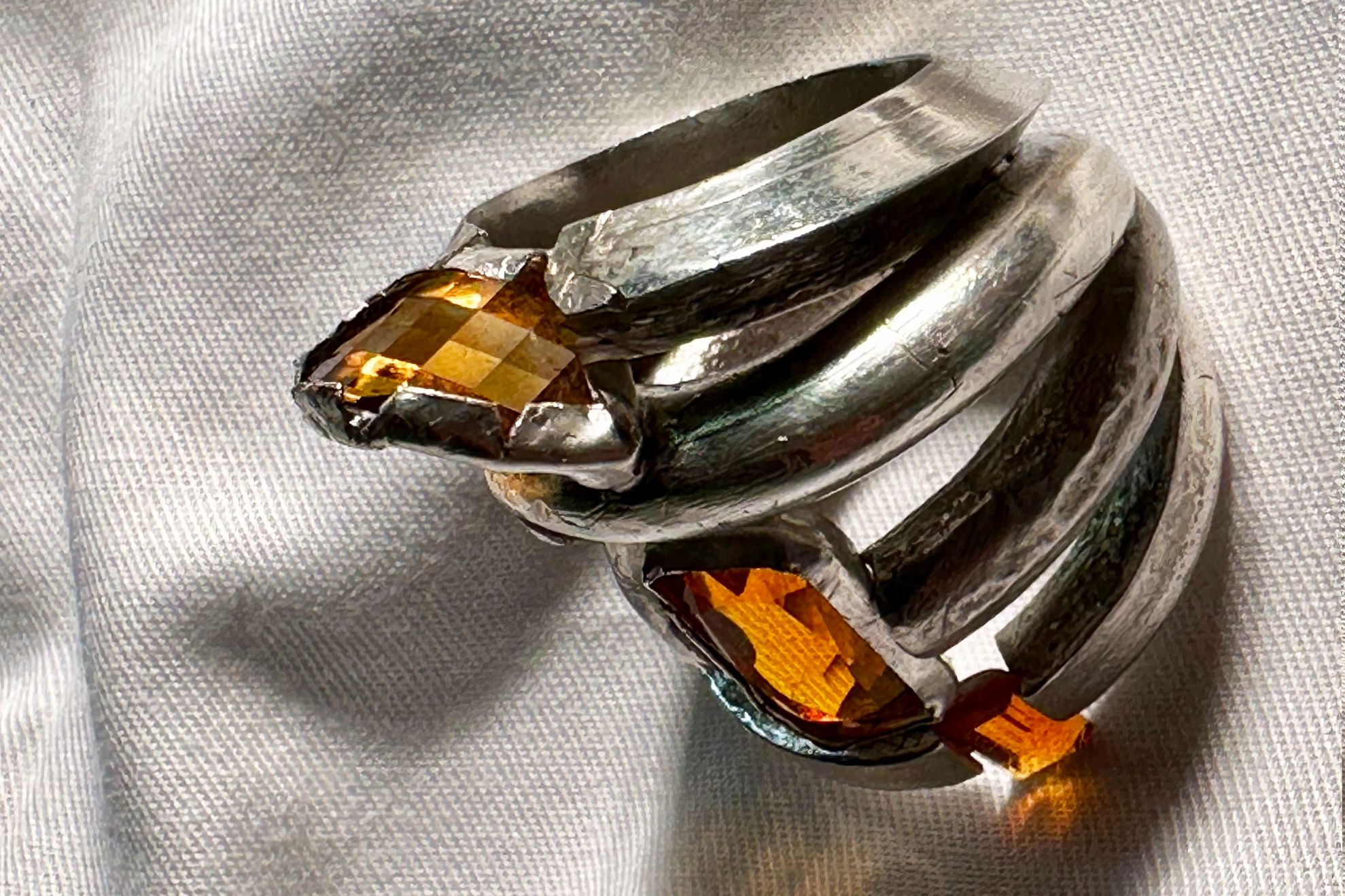
Concept: Michèle Lamy
The piece of jewelry I designed and crafted is an application of fundamental
goldsmithing techniques. The starting point for the piece is a wire blank I cast myself from 925 sterling silver. From this blank, I shaped four ring strands by hand using a drawing die: a round wire, an oval strand, a rectangular strand, and a triangular strand. For each of these four ring strands, I then devised a
different type of setting and prepared the individual ring bands accordingly—that is, I sawed out a recess for the stone and so on. I then soldered the four ring bands together to form a single structure, focusing primarily on creating a visually striking and interesting shape while still ensuring the ring is comfortable and easy for the customer to wear.
More
The next step was to set the stones—four citrines in total—into their respective positions on the ring band. Each stone has a different cut, further emphasizing the unique character of the ring band that holds it. A special feature is that two of the citrines are not permanently set and can be removed from the ring with a sliding or clicking motion. This adds a playful element for the wearer and even makes it possible to swap out these stones.
The idea behind the ring is that each of the four rings could function and be worn on its own as a standalone, conceptually interesting piece of jewelry. When combined, however, they form a whole that breaks away from the traditional ring in its classic form and reimagines it. In our industry, it is essential to be able to constantly present prospective customers with new incentives and developments in order to have a chance of standing out from the vast array of pieces available.
The principle I applied is initially reflected in the piece of jewelry I submitted, but what’s truly exciting is the potential offered by this design method. It opens up endless possibilities for further developing and modifying the shape, size, and material of the ring strands as well as the stones used. This, then, highlights the creative aspect of the piece. However, a fundamental goal in its creation was, above all, to offer the wearer a piece of jewelry that stands out and possesses an aura of uniqueness.
Today more than ever, prospective buyers are virtually inundated with offers. Especially in the
lower-priced jewelry segment, it seems a new jewelry brand emerges every day, flooding us with its offerings. This isn’t bad in and of itself, but such vendors repeatedly churn out the same easily replicable pieces and styles, making them all look exactly alike. Like many other jewelry makers, I am therefore particularly committed to creating pieces that cannot be easily copied using CAD or by outsourcing to a low-cost workshop, but rather reflect the true value of the craftsmanship and training of skilled artisans. The ring I submitted reflects this in a simple and easy-to-understand way, while at the same time impressing with its professional design and execution.
Arash Asgari (Italy)
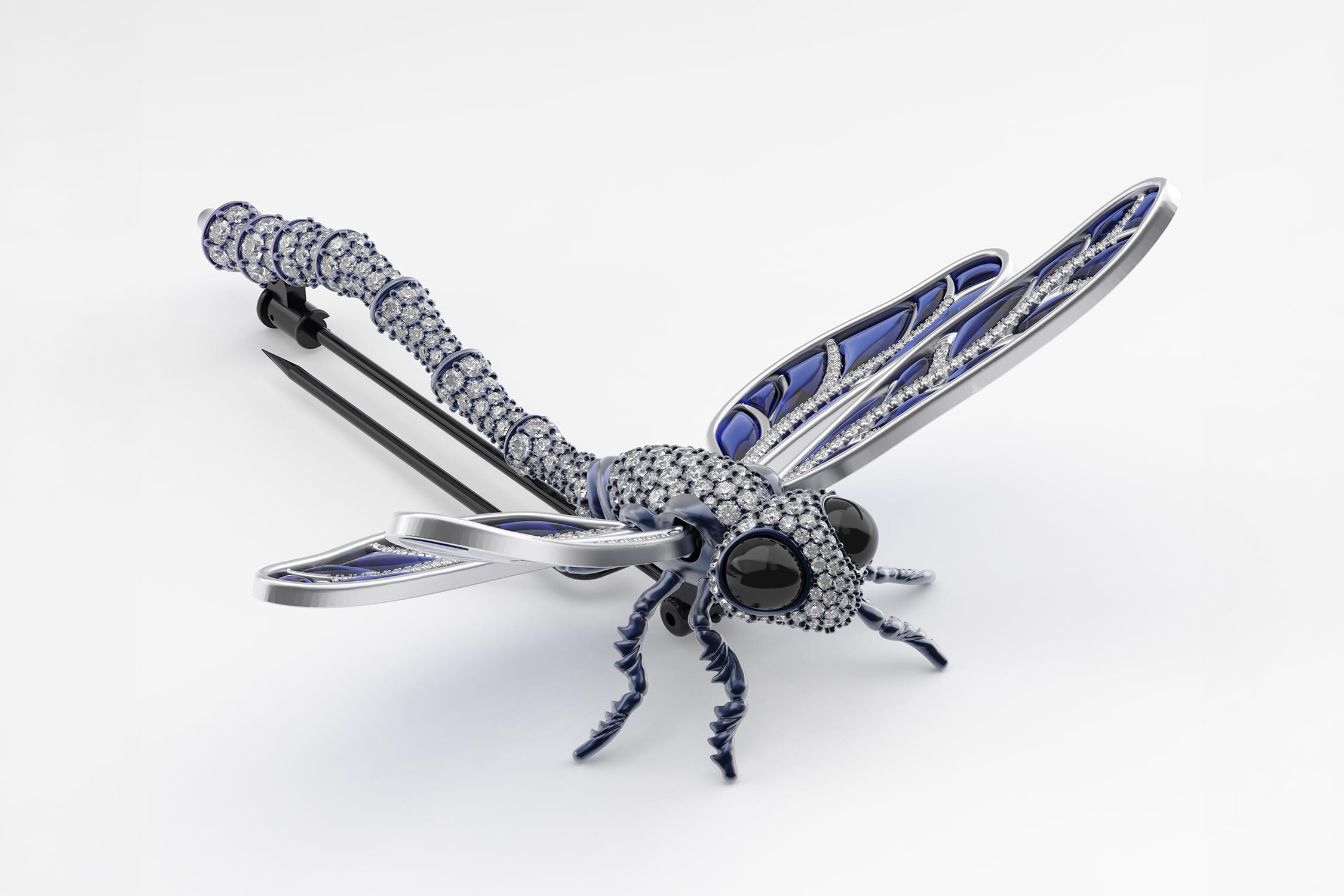
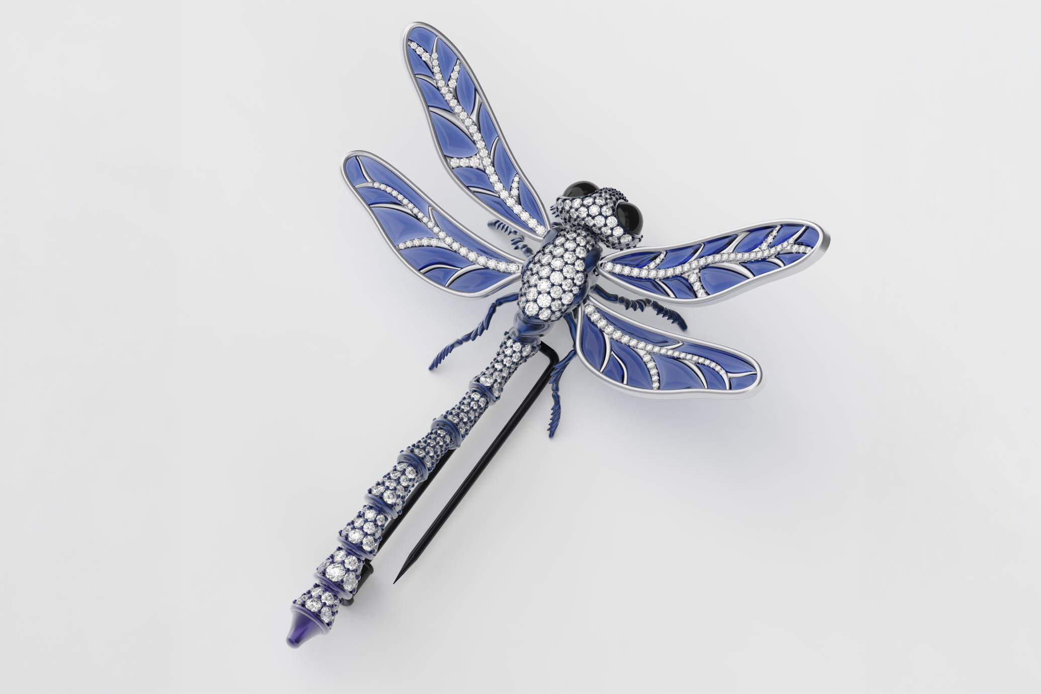
Concept: Dragonfly Brooch
A Jewel That Responds to the Wearer
Dragonfly is a high jewellery brooch inspired by the movement of a dragonfly and by the way a jewel changes when it is worn.
The project started from observing the insect in motion. Its wings vibrate quickly, while its segmented body moves in a softer and slower way. I wanted to translate these qualities into the jewellery itself instead of using the dragonfly only as a visual reference.
For this reason, the brooch is not completely static. Small movements of the wearer can activate the wings and abdomen, allowing the piece to change subtly while it is being worn. This interaction between the person and the jewel became one of the main ideas behind the project.
More
Movement and Innovation
The brooch uses two different types of controlled movement.
The four wings use a tremblant mechanism that allows them to produce a light vibration when the wearer moves. The movement is intentionally subtle so that the wings remain visually stable while still giving the piece a sense of life.
The abdomen is divided into articulated sections. Each section can rotate within a limited range, allowing the tail to change position without losing the overall form of the dragonfly.
These two systems create different reactions in the same jewel. The wings respond quickly, while the abdomen moves more gradually. Movement was therefore considered from the beginning as part of the design, rather than as an additional decorative feature.
Materials and Visual Identity
The head, thorax, abdomen, legs and most of the structural body are designed in anodized titanium. Titanium was selected because its relatively low weight is useful for a detailed and articulated brooch, while its strength makes it suitable for structural and moving components.
The anodized surface changes from deep blue to violet. These colours were chosen to recall the iridescent qualities often seen in insects and to create contrast with the white diamonds.
The wings are made from white gold and contain translucent blue sapphire glass. Their internal geometry is inspired by the branching structure of natural dragonfly wings, but simplified and adapted to jewellery construction.
Diamonds are placed along selected parts of the wings and continue across the head, thorax and abdomen. The design contains 445 individually positioned round diamonds, ranging approximately from 0.7 mm to 2.4 mm.
The stones follow the form and segmentation of the body, allowing the reflections to change as the angle of the brooch changes.
The eyes are made from black onyx cabochons, creating a strong dark contrast with the surrounding diamonds.
Designed for Physical Production
Dragonfly is currently presented through its completed CAD model and rendered images, but it has been developed with physical production in mind.
During the CAD process, I considered the internal structure, stone settings, mechanical connections, clearances between moving parts, metal thicknesses and assembly.
The abdomen is made from separate sections connected by joints that allow a controlled amount of rotation. The movement is limited to maintain stability and preserve the intended silhouette.
The wings use a concealed spring system positioned close to the thorax. During production, this mechanism can be adjusted by the goldsmith to achieve the correct balance between stability and vibration.
Stone settings were developed together with the main geometry of the jewel. Pavé areas, individual stone seats and structural thicknesses were considered during the modelling process rather than added after the external form was completed.
Most mechanical elements are positioned behind or inside the body so that they remain secondary to the appearance of the jewellery.
Wearability
Although Dragonfly is a statement high jewellery piece, it has been designed to be worn.
Using titanium for the body and articulated sections helps reduce the overall weight. White gold is concentrated mainly in the wings, where its rigidity and bright appearance contribute directly to the design.
The moving parts are also controlled for practical reasons. The wings vibrate rather than swing freely, and the abdomen moves only within a limited range. This allows the jewel to react to the wearer while remaining stable on the garment.
A pin mechanism is positioned behind the body so that it does not interfere with the front view of the brooch.
The four wings also distribute the visual volume across a wider area instead of concentrating the entire form in one heavy central point.
Conclusion
Dragonfly explores the connection between a person, a jewel and movement.
The project does not try to reproduce a dragonfly exactly as it appears in nature. Instead, it translates some of its most recognizable qualities, such as vibrating wings, segmented movement and lightness, into a wearable object.
Traditional high jewellery materials are combined with titanium, CAD development and concealed mechanical systems. The technical elements support the experience of the jewel rather than becoming its main subject.
When the wearer moves, the wings can tremble, the abdomen can shift slightly and the reflections of the diamonds can change.
The final appearance of Dragonfly is therefore not completely fixed. Part of its character comes from the person wearing it.
Elveda Bayrak (Germany)
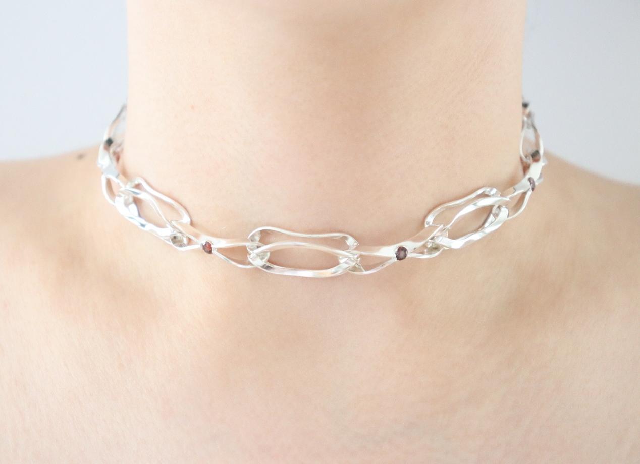
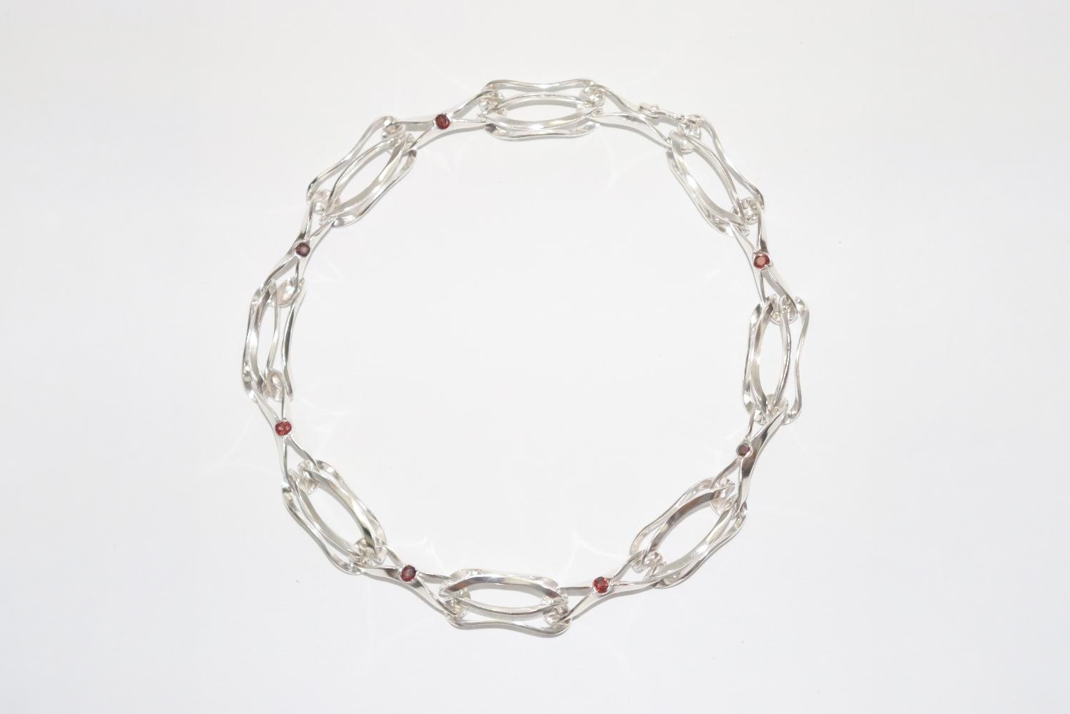
Concept: Collier – A Fluid Connection
With my necklace, I wanted to design a completely new chain link. From the very beginning, the most important thing for me was to avoid using connecting links and instead create a link that flows seamlessly into the next one. I wanted it to appear light and not rigid—a form that remains flexible in itself yet can be reimagined and developed in new ways time and again.
Chains fascinate me because they consist of links that are similar or identical, yet hold each other together. It was precisely this interplay that I wanted to reimagine: A single link may seem unremarkable on its own, but when combined with the other links, it forms a strand that develops its own unique aesthetic and is harder to break than any single link alone. When the body is added at the end, the entire appearance changes once again. It was precisely this transformation—from the first link to the finished piece of jewelry—that I wanted to explore.
More
My Design Rules
- No disruption of the form caused by round intermediate links.
- A smooth transition between the individual links.
- A red color accent, because red is a bold, expressive color.
Inspiration
The basic shape of the link is inspired by the flowing patterns of nature and the human body: by the way people move in fluid motions, or how the wind, the sea, and trees are in harmony with one another, yet there is still something in between. I was interested in how things can fit together and yet differ from one another at the same time.
Just as two people—friends, relatives, or lovers—do. Like a chain that is in harmony yet retains its own character. This idea was meant to be reflected in the larger, second link: as a reminder that we connect with one another while still retaining our own spirit.
From an Oval to a Unique Shape
My design process began with a simple oval. I was interested in how far a basic shape could be transformed and abstracted until the original form was barely recognizable. I also wanted to explore how to integrate the resulting design into a piece of jewelry in a way that would create a harmonious whole. It was important to me to achieve a sense of balance and to work with the material without knowing exactly from the start what the final result would look like.
To ensure that two links of different sizes fit together seamlessly without any break between them, I deliberately chose not to alter the original shape but instead focused solely on adjusting the size. Both links are based on the same basic shape; only their proportions differ. This preserves the smooth transition, even though the links are different sizes.
Technical Implementation
To find the right shape, I first created wax models and tested which version came closest to the desired fluid transition. Using the oval as the starting point, I then translated the idea into metal until I had the perfectly flowing link.
When assembling the necklace, it became clear that a slightly wider center link gives the entire necklace greater visual depth and is more comfortable to wear. To create a uniform necklace, I made silicone molds of both link shapes and cast the individual parts. Red garnets were set into the larger link while it was still a wax model and cast along with it, so that the stone and the form form a single unit from the very beginning.
In addition, multiple rows of links can be combined, giving the overall look a new aesthetic.
It was particularly important to me to have a clasp that blends seamlessly into the overall design rather than interrupting the flowing line of the necklace. To achieve this, I integrated the clasp directly into the larger link: an opening is cut so that the clasp can be hooked in like an “S,” and it is soldered to one side with a hinge. The ball and the piece of wire serve as additional security.
This way, the link opens and closes on its own, and the transition to the smaller link remains seamless—the clasp becomes part of the form.
Conclusion
From a single, constantly reimagined basic form, a necklace has emerged that requires no connecting links, with each link flowing seamlessly into the next. It is only through the interplay of the links—and ultimately in the finished necklace—that the true aesthetic unfolds: an image that evolves continuously from the individual link to the entire piece of jewelry, just as people who are connected to one another yet retain their own distinct character.
When worn, the necklace also adapts perfectly to the neck, making it almost imperceptible. It becomes one with the body, and the wearer feels light and at ease.
David Gleyzer (Germany)
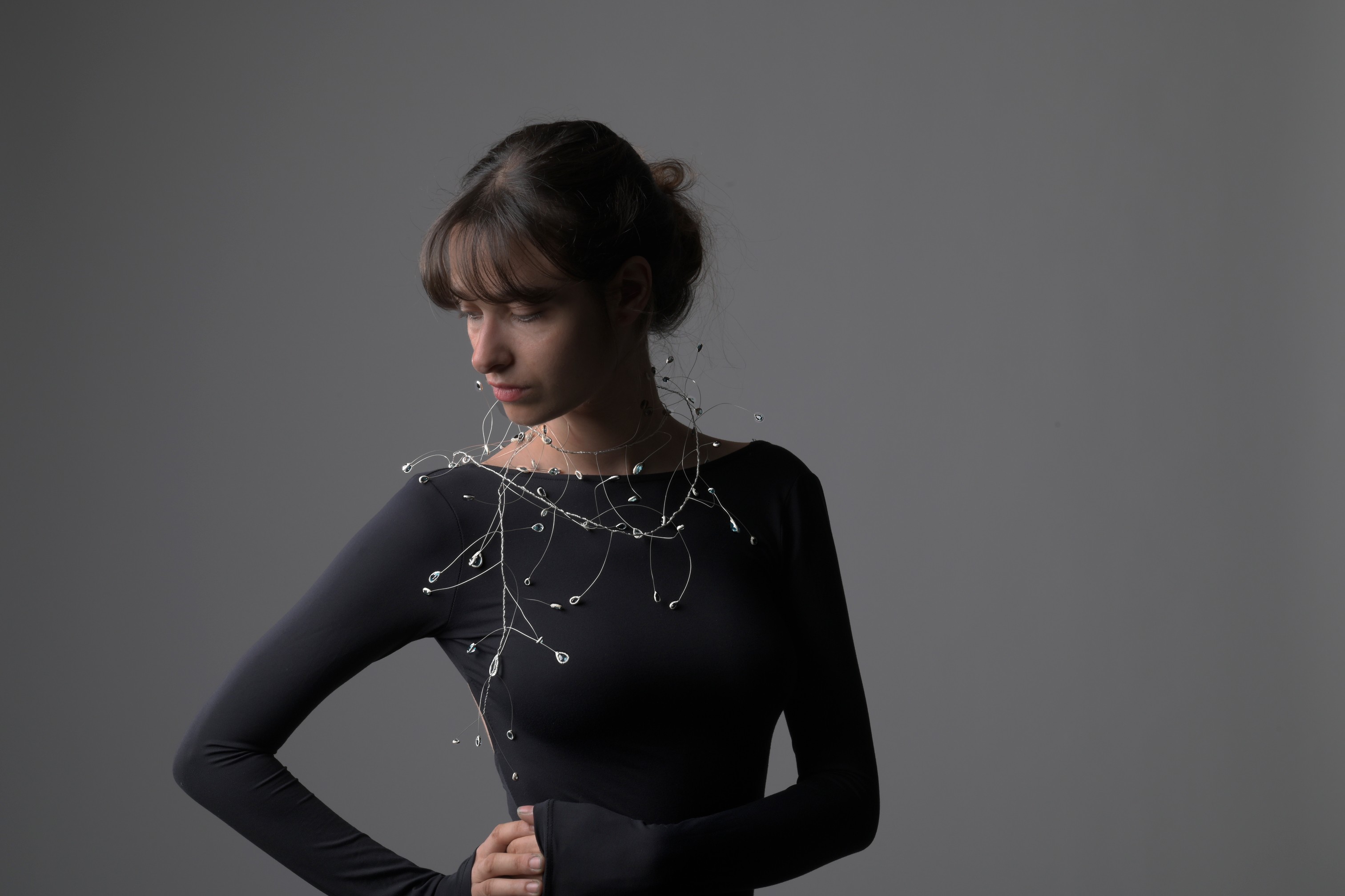
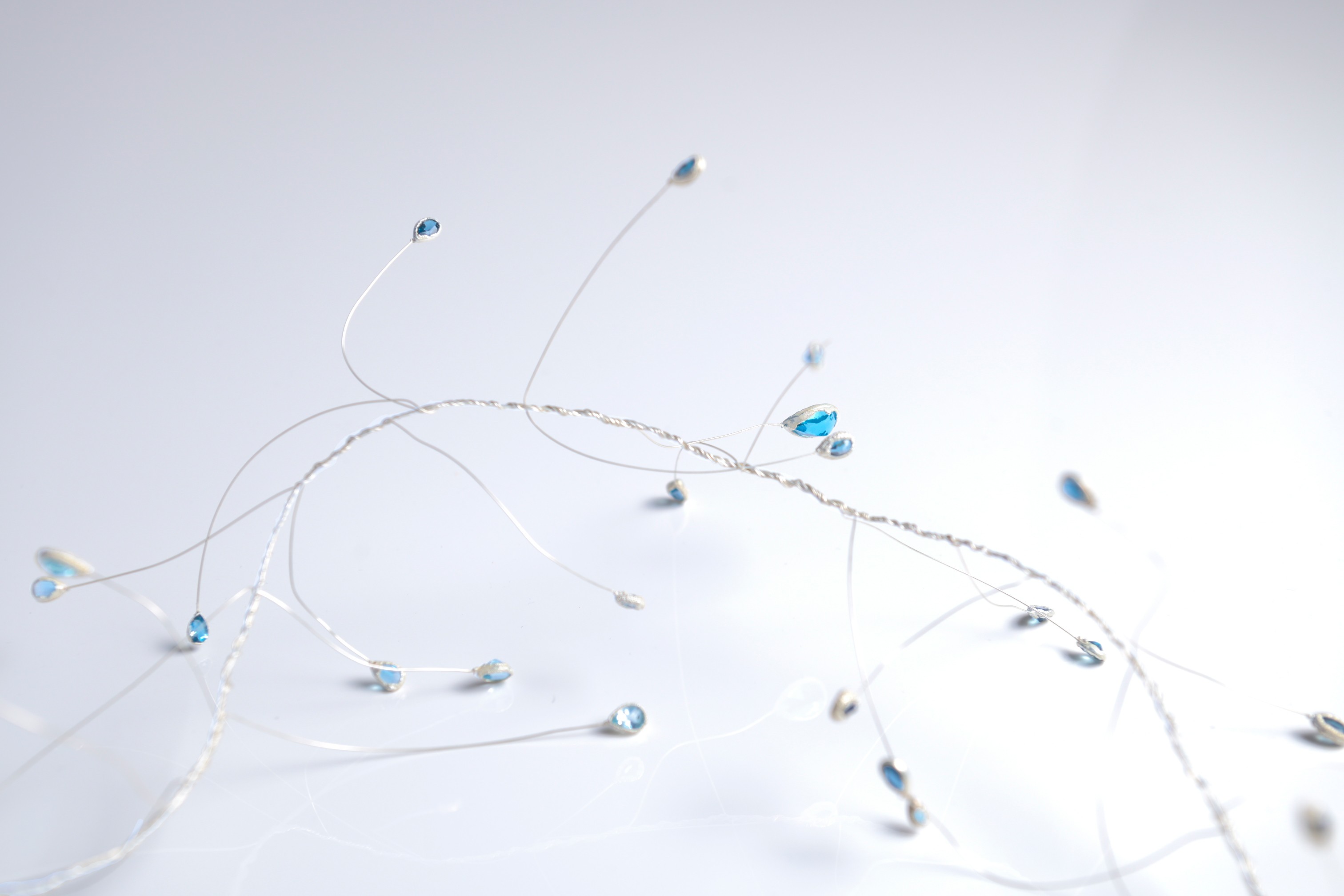
Concept: Trembling Water
As an artist, I feel responsible for art and for the world’s future, so I thought it was very important to touch on the topic of water. Water is an important natural resource and a sign of life on Earth. This gives the planet and all its inhabitants life and prosperity. That is why I create a connection between people and global issues through jewelry.
Mehr
This piece of jewelry tells about the water that trembles with every small movement of the wearer. The boa-necklace wraps around the body and flows off it like water. The special feature of this jewelry is that everyone can choose for themselves how to wear this boa and how it will look on the body, because it is flexible and versatile. Necklace can be worn in any format, customized and easily manipulated.
Stones are like drops of water on thin silver threads, come to life with slight movement of the wearer.
The topazes from London to Sky Blue have a pear cut, which allows the center of gravity of the back of the stone pavilion to affect the thin wire, increasing the oscillation amplitude.
The topazes in this work demonstrate an exquisite play of colors, smoothly shifting from one shade to another, creating a sense of depth and bright light. Each stone is matched in color, forming a complete and harmonious composition. From the dark London topaz, which conveys the color of the water depth, splashes of water rush out, gradually becoming lighter and acquiring the saturated color of Swiss blue topaz, and gradually coming out, the jets of water are released from the pressure of the depth, becoming lighter and more airy, like the sky, a color that perfectly conveys sky-blue topaz.
The stones are galvanized with a fine silver layer. To do this, a special silver varnish was first applied to the stones, which attracted silver to itself during coating. The wire was stretched and then laser-soldered to the galvanized stones.
A wire about 20 cm long was taken and stones were soldered to both ends.
In this way, 40 blanks were created, which were then intertwined into a common knot, keeping it flexible.
This piece of jewelry creates a connection between people and water. Wearing this jewelry, one can remind that water is as valuable as precious metals and precious stone.
Maciek Kasprzak (Germany)
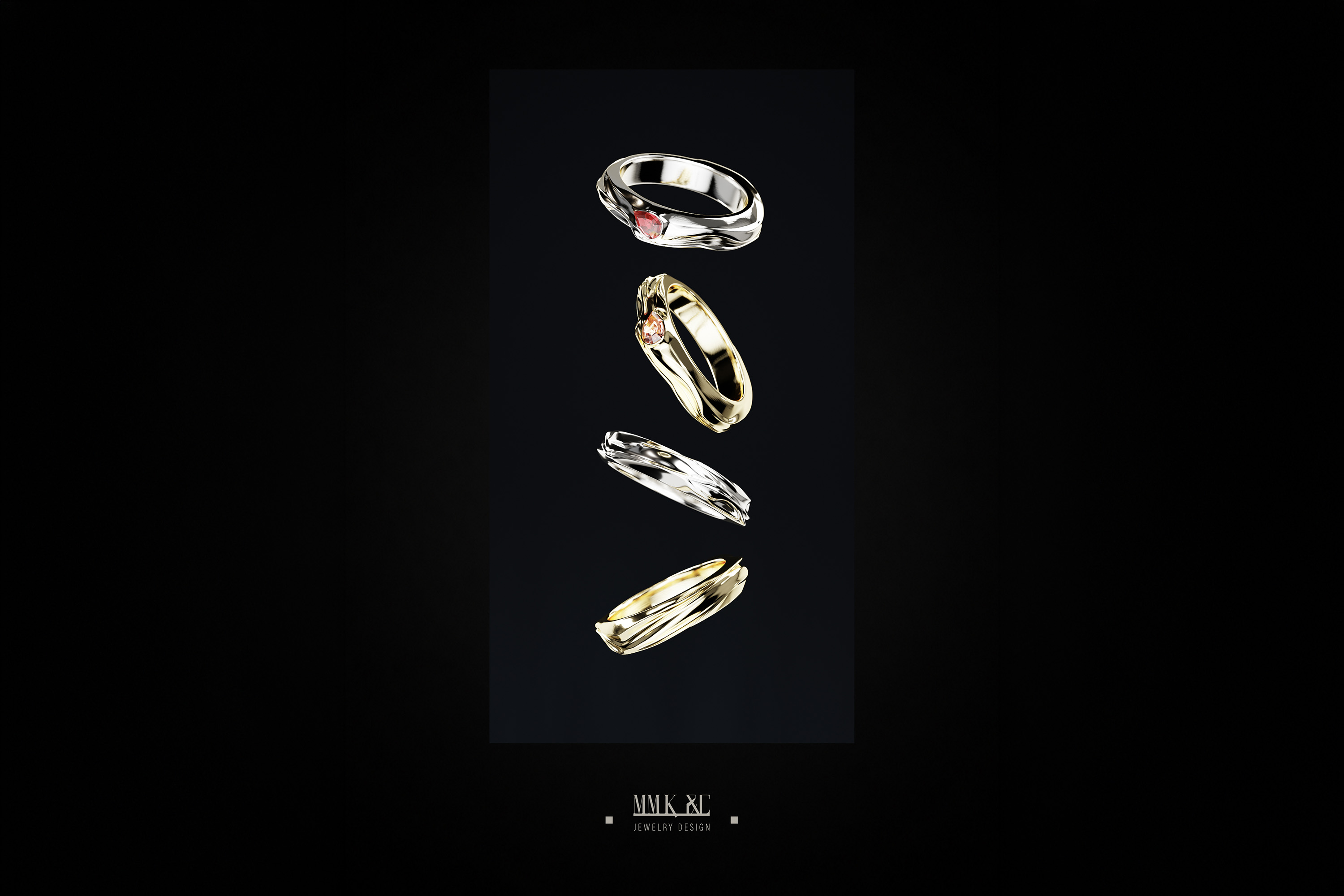
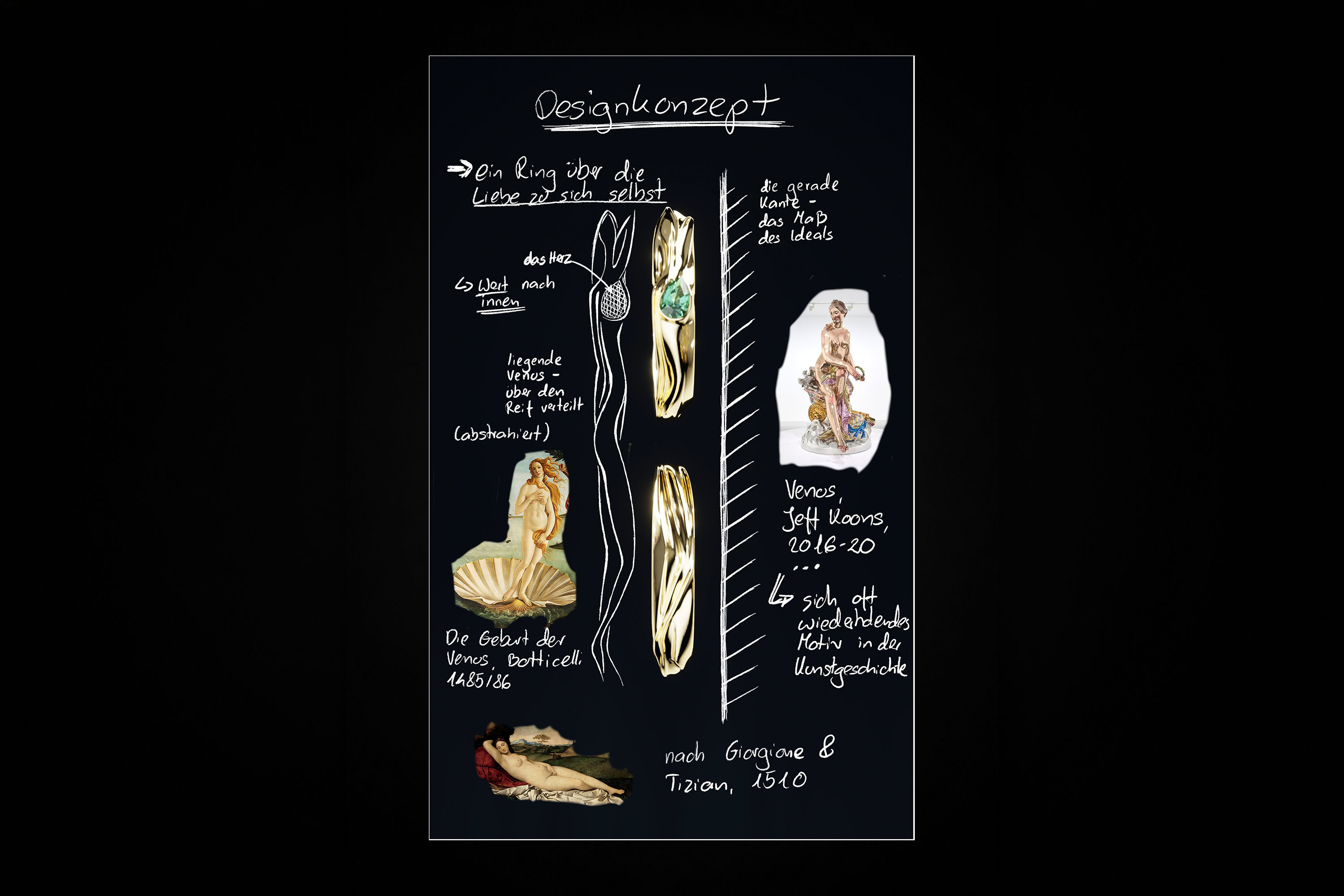
Concept: V-Ring
The V-Ring isn’t just meant to please. It poses a question that a woman rarely voices aloud: By what measure is her worth determined, and how much of it still lies in the eyes of others—in her appearance and in the image she believes she must live up to?
The ring was inspired by Venus, the Roman goddess of beauty, grace, and love. The outline of a reclining Venus spans the entire band, borrowed from “Giorgione’s Sleeping Venus” and numerous interpretations of the same motif throughout art history. In my interpretation, the line that defines this form is deliberately dissolved, fluidized, and does not reveal a specific body. It is precisely in its blurriness that the ring’s primary message lies: there is no single ideal.
Mehr
This soft line is countered by straight edges on both sides. Where the contour yields, the outer edge of the ring stands in stark, geometric contrast, framing the flowing body like a rule. The ideal is not—and never has been—the body itself. It is the frame into which it is forced. By making this frame visible—laid hard and unwavering around the soft form—the ring simultaneously calls it into question.
At heart level rests a teardrop-cut stone, held in place by an almost closed bezel. That it sits exactly there is no coincidence. While the edges impose the standard from the outside—the scrutinizing gaze and the judgment of others—the stone shifts the question inward, to where a woman determines her own worth. The setting encloses it and offers it protection. In this way, the ring places value at the center—in the heart—rather than on the periphery.
The ring extends this same idea through three stones, each embodying a different intensity of self-care. The morganite stands for quiet self-acceptance, the emerald for renewal, and the ruby for vitality. The ruby is set in rhodium-plated white gold, whose cool brightness brings out the deep red’s full radiance, while the morganite and emerald rest in warm yellow gold, which absorbs and radiates their warmth.
In the end, the ring embodies a single conviction: that a woman has the right to love herself just as she is. This is not a rebellion against the ideals that society holds up to her, but rather a state of independence from them. For her worth is not measured by how close she is to the ideal; it lies within her.
Sebastian Prater (Germany)
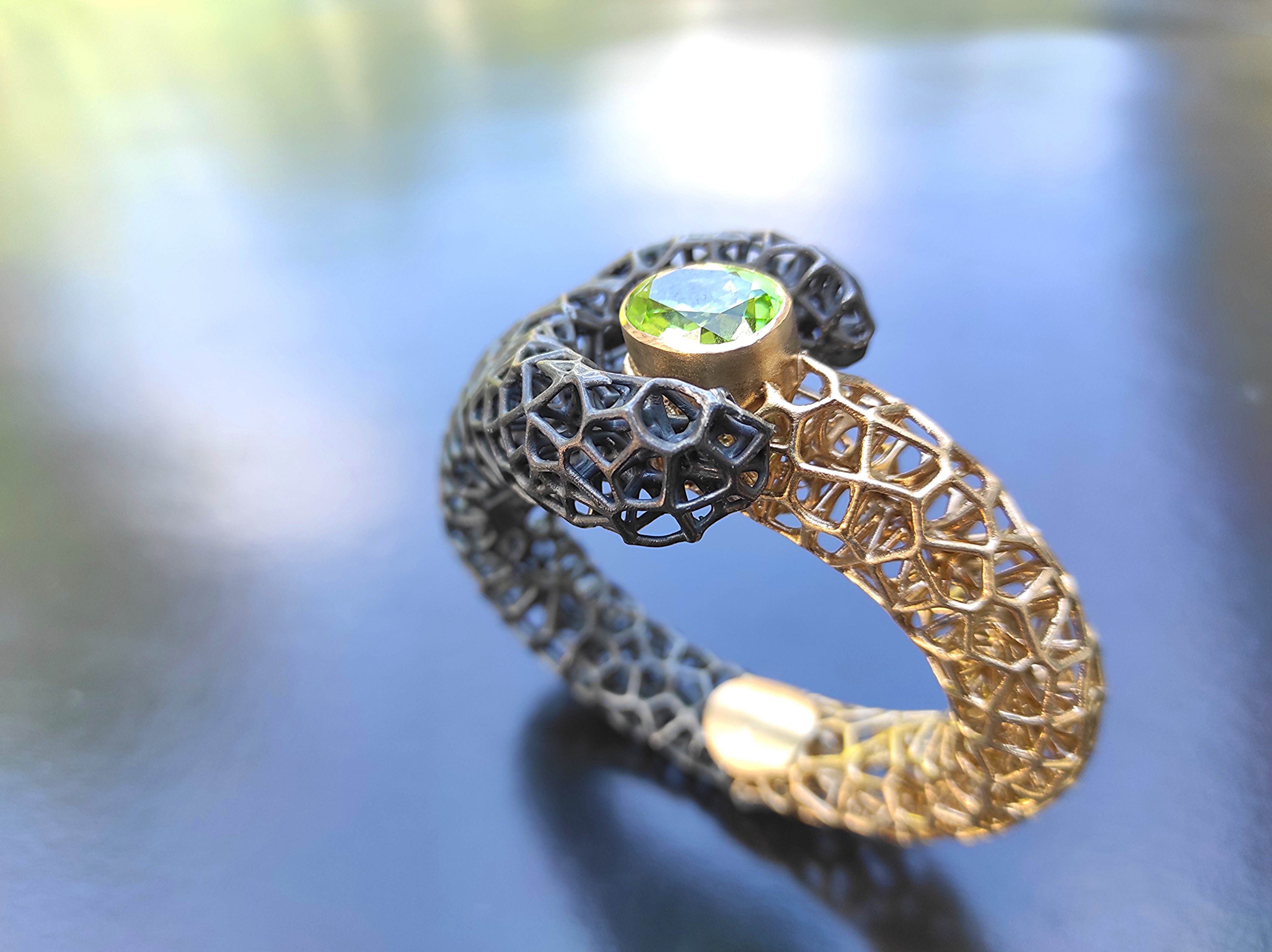
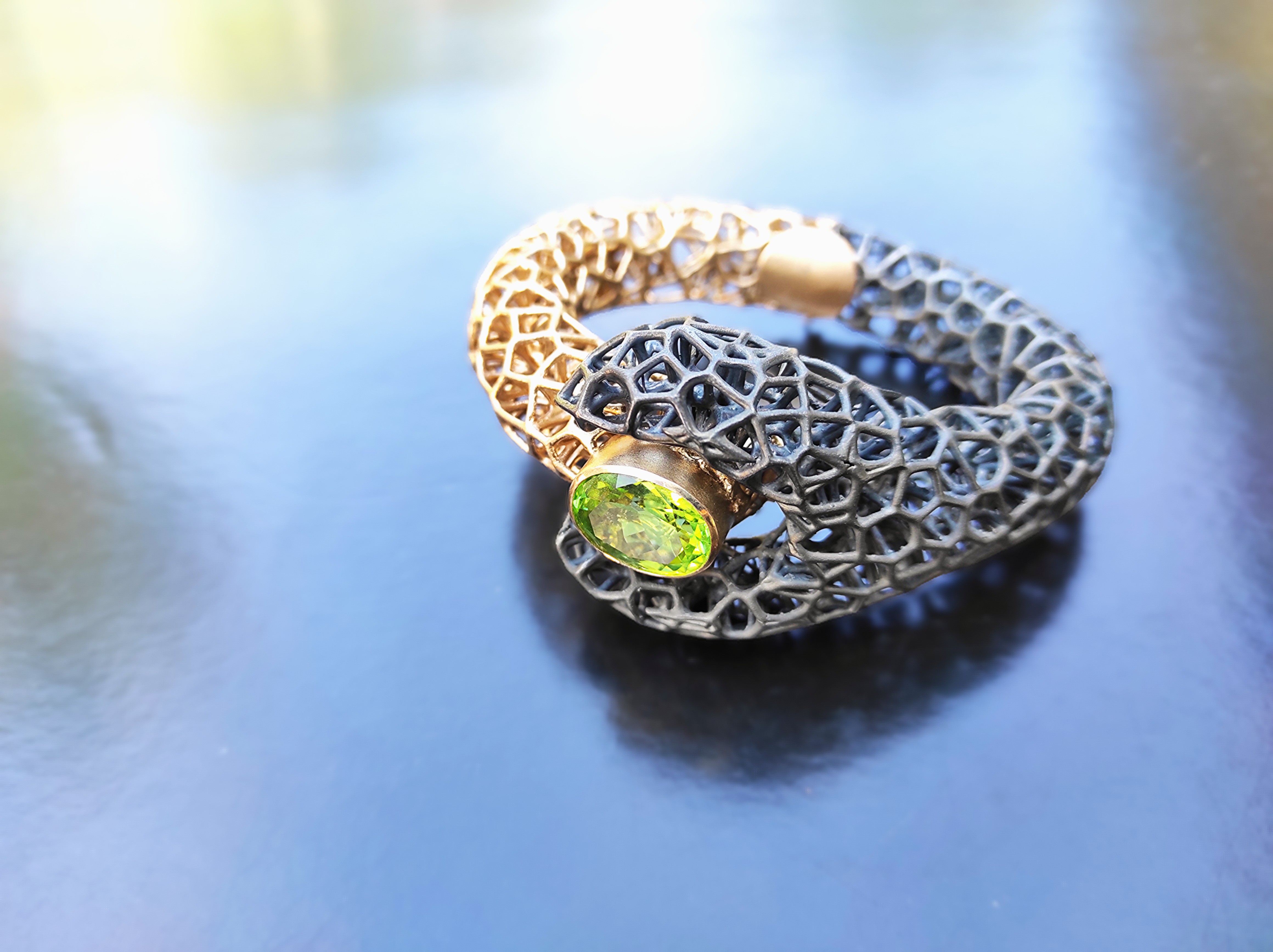
Concept: Two Minds
What happens when two completely different realities collide and one tries to impose an idea on the other? Are one’s own views abandoned, is it merely a reshaping, or can there even be a subtle assertion of one’s will over the other’s? This thought experiment is explored in my “Two Minds” bangle. With a structure reminiscent of neural networks, I explore this thought experiment and let the two parts collide.
More
In my bangle, the two parts of the band are positioned as opposites and intertwined. They are distinguished from one another by differences in materiality, surface finish, and color. As two parts of a whole, they remain recognizable through their connecting texture; however, their differing forms convey the impression of two separate entities. One half of the bangle has a solid, structured design and gains a sense of gravity from a dominant peridot; the other part is forked, more delicate, yet larger in form.
I believe jewelry is inextricably linked to the viewer and the moment of its reception, whether one likes it or not. But I like the idea that the form itself also has something to say. That’s why I like to set a direction in my jewelry—be it a line, a pull, or something similar.
Nevertheless, the design is such that it leaves it unclear whether the dark part splits open or encloses the golden part—which, nominally, is its central element, the stone. Thus, ultimately, the wearer can choose for themselves how they see—or rather, how they would like to see—this scenario play out. Personally, I like the idea that both parts hold their own.
The bangle can be split in the middle and folds open on a triple hinge (the covering plate is an essential safeguard against pinching). The bangle is secured with a magnetic clasp.
The design was created using software typically used for architecture, but which is better suited for creating complex structures. The hinge mechanism and setting were then crafted by hand and incorporated into the piece.
Isabella Vincze (Austria)
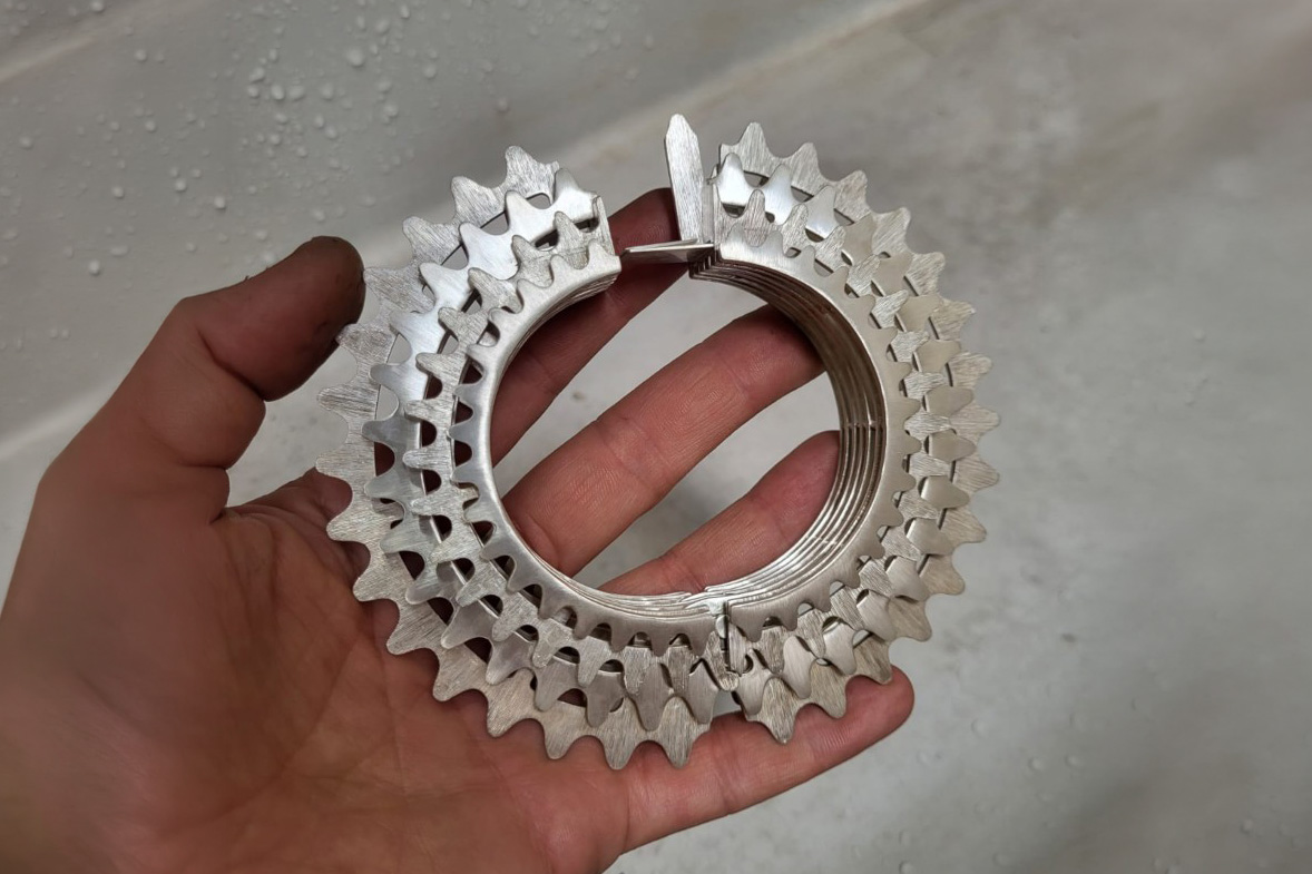
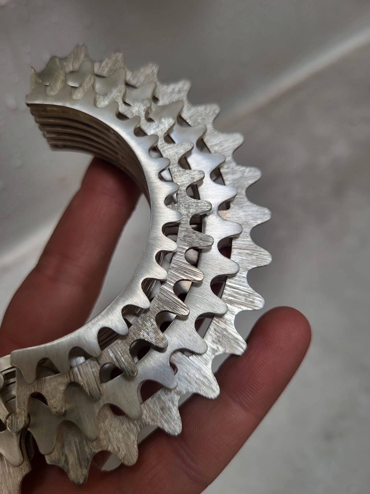
Concept: WHEEL OF ENDURANCE
The creative inspiration behind this masterpiece stems from a 5,000-kilometer cycling journey from Vienna through Pforzheim and across France. This physically and mentally challenging experience taught me the essential principles of endurance (“If you feel weak, do something strong”), continuity (“Always keep moving”), and the acceptance of constant change (“The only constant in life is change”).
This piece of jewelry serves as a symbol of drive, strength, and the overcoming of one’s own limits. The design abstracts the mechanics of the bicycle—whose engine is the human being itself—and translates the aesthetics of a bicycle cassette into a wearable object.
More
Form and Design
The bangle is conceived as a serial sequence of seven gear-like elements. Along the vertical axis, these increase in size and height toward the center, then decrease again in a mirror-symmetrical pattern.
• Rhythm & Dynamics: The staggered arrangement of the rows of teeth creates a flowing visual effect that suggests rotation and movement.
• Transparency: Strategic cutouts in the wheel bodies, as well as the open spaces between the planes created by spacers, lend the solid design a sense of technical lightness.
• Interplay of Surfaces: The interplay between precisely brushed (satin-finished) surfaces and high-gloss polished edges emphasizes the sculptural depth. The satin finish visually reinforces the radial alignment of the teeth.
Material Selection
To meet the various mechanical requirements, a specific combination of materials was selected:
• Body (gears, housing, hinges): 935 silver for a high-quality appearance and good machinability.
• Functional elements (connecting pins, spring): 800 silver, to guarantee long-term functionality due to the alloy’s higher hardness.
• High-stress components (threaded pins, screws): 585 nickel white gold. This material was chosen to ensure maximum tensile strength and low wear at the critical connection points.
Design and Technical Construction
The bangle is assembled using a complex interlocking system that is built from the inside out. The precision of the fits creates a structure that holds together primarily through tension and structural logic.
• Joining technique: Cylindrical pins of varying lengths connect the segments. While the main pins penetrate the entire body, secondary pins specifically secure individual layers.
• Special feature: An integrated threaded pin on the second gear allows the outer element to be assembled only after the final finishing of the lock—a design solution to ensure surface quality.
Movement Mechanics
The bangle’s articulation is achieved through a combined hinge movement in two planes:
- Horizontal plane (flat hinge): The two halves are connected by concentrically arranged, lamellar fingers. A transverse locking pin limits the opening angle to 45°, which both optimizes handling and protects the mechanism from overload.
- Vertical plane: A five-part hinge with varying segment lengths connects the central gears. The uneven spacing was deliberately chosen to harmoniously integrate the hinge joints into the overall visual appearance of the spaces between the segments.
Closure
A “floating” box lock completes the technical design.
• Integration: The latch’s handle echoes the geometry of the gears and blends seamlessly into the silhouette.
• Function: The spring, secured in the short section of the box, locks securely behind the guide plate, which seamlessly continues the curve of the outer rows of teeth.
Sarah Weindl (Austria)
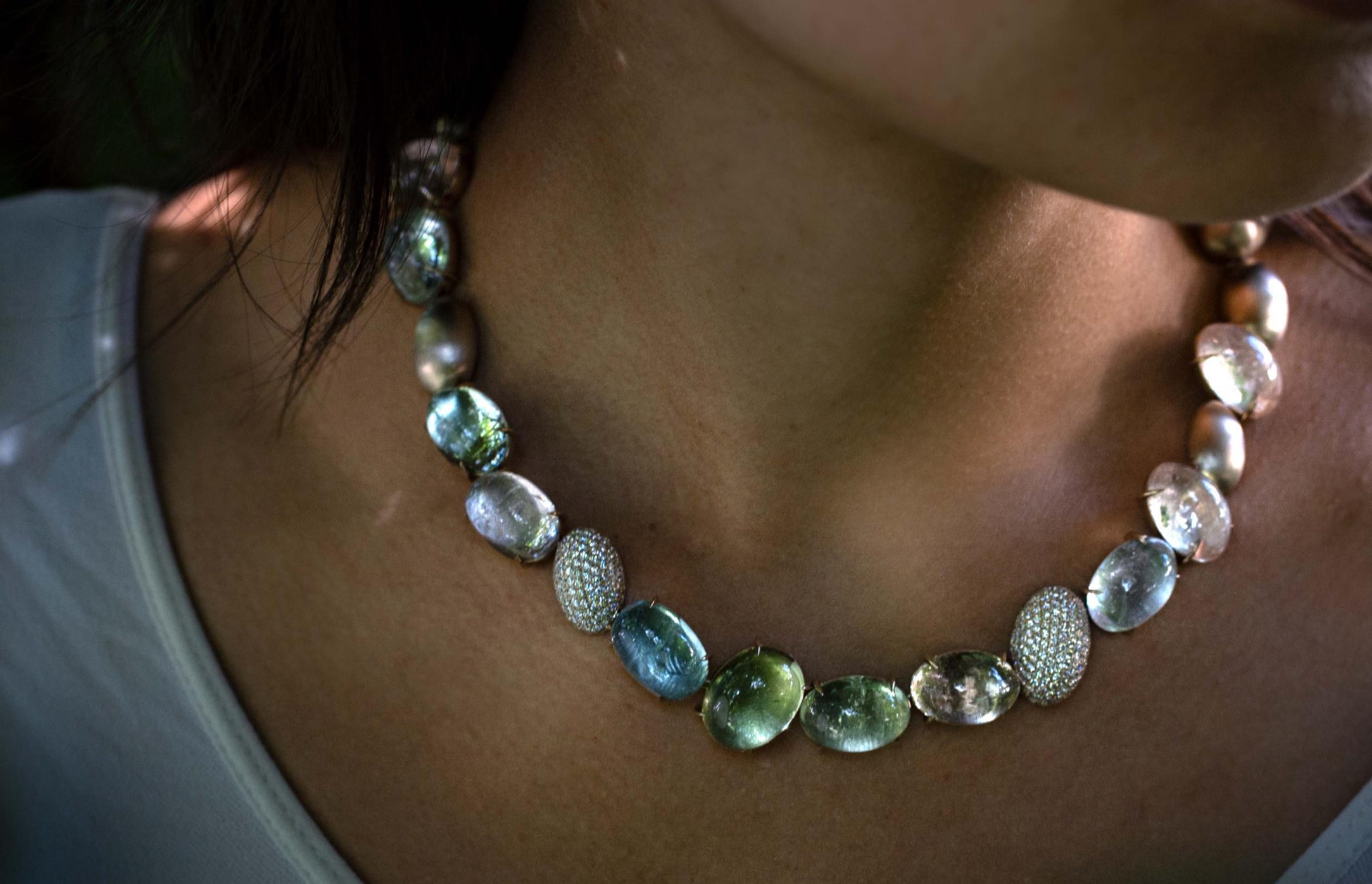
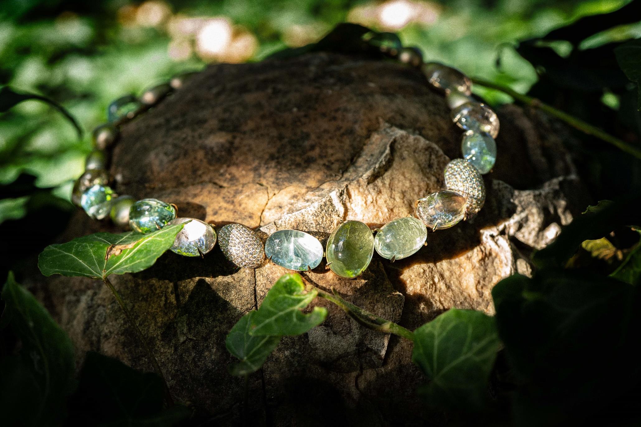
Concept: Water Spring
The design began with pastel-colored beryl cabochons. These inspired the water motif and dictated the shape of the necklace’s other elements. The necklace was deliberately not crafted entirely from these cabochons. The metal elements create a contrast between the lightness of the translucent beryls and the visual weight of opaque stones. This visual weight is expressed through the metal. The metal elements are crafted from unplated white gold. Only two elements feature pavé setting. These capture the light and reflect it. The structure of bird feathers was rolled out in platinum. The resulting thin plates were placed beneath the beryls. The delicate, linear structure of the feathers underscores the lightness of the beryls. In contrast to the pavé elements, they create a sense of spatial depth. Depending on the angle of the light, the structure of the feathers becomes visible, creating subtle reflections of light.
More
All elements of the necklace are slightly movable so that they can adapt to the shape of the body. Their mobility was intentionally limited somewhat so that the necklace retains its shape and arrangement when worn. The piece features 82g of un-rhodium-plated white gold, 6.5g of platinum, 267 diamonds totaling 2.94 ct, and 13 cabochons with a combined weight of 171 ct. As mentioned earlier, bird feathers were embossed into the polished platinum plates using a rolling process. The necklace fastens with a built-in Heinz clasp integrated into one of the white gold elements. The unrhodium-plated white gold has a particularly natural appearance and harmonizes with the multicolored cabochons, as its undertone is neither too warm nor too cool. The surfaces of the white gold elements have been given a matte finish, which emphasizes their visual weight. This creates a distinct contrast to the cabochons and the pavé elements. The single-row design of the necklace and its flexibility make it versatile and easy to wear.
The Young Designers Corner Award
Since 2012, the Munich Show – Mineralientage München has been presenting the “Young Designers Corner Award”—a prize for young talent in the jewelry industry. The competition offers dedicated creatives the opportunity to showcase their work on an international stage and demonstrate their skills. A high-caliber jury selects the eight finalists. The criteria for evaluating the jewelry and watches are: innovation, suitability for everyday wear, and technical and artistic execution.
More